
Redesign of an Existing Website
I wanted to take an existing website/app that people are actively using that is poorly designed and frustrates its users. I didn't want to be too biased here and choose one I dislike myself so I went to Reddit, r/Ireland and asked members of the Irish public which websites frustrates them. I wanted real world examples that are specific to Irish people. From here I received many different candidates for a redesign, as it turns out a lot of websites people use have poor usability and/or design. That's why UX designers are important!
One of the most common was Bus Eireann, an Irish bus company and their website which is used to book tickets or check timetables. I liked this because it is a website that a lot of Irish people will have to use and clearly it has some issues.

Goals:
Motivations:
-
Learn about Loftus Hall & it's story.
-
His trip to Ireland was cancelled.
-
He had booked a tour of the house for the trip.
-
He still wants to experience it.
Pain Points:
Notes:
James Burke
Age: 43
Occupation: Postman
Location: Washington, USA
-
Cannot experience it in person, wants an easy to find and use replacement.
-
Plenty of readings/articles about the house but currently no "experience" online.
-
Not as tech savy, so we need to design for this group of people too.
-
More interested in learning about the story.
-
Entertainment aspect important too.
Redesign of an Existing Website
*In Progress*
I wanted to take an existing website/app that people are actively using that is poorly designed and frustrates its users. I didn't want to be too biased here and choose one I dislike myself so I asked members of the Irish public which websites frustrates them. I wanted real world examples that are specific to Irish people. This was done anonymously on social media to avoid any demographic bias. From here I received many different candidates for a redesign, as it turns out a lot of websites people use have poor usability and/or design. That's why UX designers are important!
Stages of the project - the UX Process
One of the most common was Bus Eireann, an Irish bus company and their website which is used to book tickets or check timetables. I liked this because it is a website that a lot of Irish people will have to use and clearly it has some issues.
My first port of call was to produce some personas. The users of this website can be very broad of course as it is a public transport website and people of all demographics need public transport at least at some point.
1. Empathise
-
Research
-
Personas
-
Empathy mapping
-
Testing
3.Design
-
Ideation
-
Wireframing
-
Prototyping
2. Define
-
Problem definition
-
How Might We Solve
These Problems

Goals:
Motivations:
-
Needs to get to the airport for a flight.
-
Wants a cost effective route.
-
Needs accurate timetables as she has to arrive in enough time to make her flight.
Pain Points:
Notes:
Jessica Cullen
Age: 17
Occupation: Student
Location: Carracastle, Co Mayo
-
Finding a timetable, booking tickets.
-
Not sure how it works.
-
No alternatives.
-
First time travelling alone with her friends, not used to these type of websites.

Goals:
Motivations:
-
Wants to get to Dublin to meet family
-
Wants to view timetables but not sure how.
-
Prefers to pay in person rather than online.
Pain Points:
Notes:
Mary O'Shea
Age: 68
Occupation: Retired
Location: Cork City, Co Cork
-
Not very tech savy, needs a simple UX to find and book her tickets.
James Byrne
Age: 46
Occupation: Electrician
Location: Dundalk, Co Louth

Goals:
-
Find and book cheap transport.
Pain Points:
Notes:
Motivations:
-
Needs transport to a stag event.
-
Can't drive.
-
Doesn't usually take public transport, drives to work etc.
-
No leap card.
-
Never used the website before
-
Not familiar with leap cards, booking tickets, timetables etc.
Conor Shaw
Age: 27
Occupation: Accountant
Location: Kilcock, Co. Kildare
-
Check times for his bus to work
-
Uses the bus weekly
Goals:
Motivations:
Pain Points:
Notes:
-
Wants to get to work on time
-
Wants to check if a bus is late as this would make him late for work.
-
Uses a leap card, does not use the website to book tickets.
-
Has an alternative, train.
There are a wide range of people with different levels of experience with both websites/tech and public transport that you have to consider when designer such a website.
Someone like Conor who uses Bus Eireann weekly won't be using the booking platform but rather checking up on times and delays as he has a leap card (a card with preloaded balance that is scanned) that he uses so he doesn't need single tickets.
Someone such as Mary also isn't purchasing tickets online, but for completely different reasons, she isn't as tech savy but still needs to find a timetable as much as anyone else and if there is poor usability this can really effect people's day to day, she might need to ask for help for example.
Then you have people such as James or Jessica who may use public transport rarely, a few times a year who will need to quickly and easily book a ticket or find accurate up to date information, and the airport service information is vital as a late bus or changes to a schedule could mean people miss their flights and that can be costly.
I wanted to cover these personas as a way to empathize with other groups of people, rather than taking my own bias and experience of having used the website and/or service.
Competitor Analysis


I started by visiting competing websites to get an idea of how they look, feel and run.
I wanted to established the conventions each use such as the search bar being front and center on each or how they use tabs to navigate quickly.
This gave me an idea of their key design principles and patterns, e.g. perceivabillity and visual hierarchy
Screens
 |  |  |  |
|---|---|---|---|
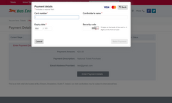 |
I am going to examine the flow of a user trying to purchase a ticket. There are 6 screens as you can see above, minus the payment confirmation screen as I didn't actually pay for a ticket I don't need!
Now bare in mind these users may need to access the site on mobile, such as Conor who is checking bus times while walking out of his office. I will cover this a bit later.
Research- Survey
I then sent our a survey to some of the people who answered my original question of which website frustrates them. Again these are all Irish people and people who use Bus Eireann. I wanted to get an idea of when, how and why they were using the service and what areas frustrated them the most as I could then focus on those areas in my designs.


1-5 Scale


