
The Process
Research
Wireframes
Prototypes
Continuous Testing
At Each Stage
Finished Product
Ideation, feasilibity & requirements gathering
Our project began in September 2020. Three of us formed a group and got an idea of our background and skills. We began brainstorming ideas and decided an interactive web based story would be a good idea, given my web design/development skills and their storytelling skills.
From here we began researching different stories and ideas. We came across Loftus Hall, a famous 'Haunted House' in Wexford, Ireland. As this project was completed during 2020 the actual house, a tourist attraction, was closed. We thought telling the story of the house online, in an interactive format would be both entertaining and informative and help provide the experience and story while in lockdown. We identified potential users for our website and created personas of them to ensure we know who we were designing for and the purpose of the website.
We identified two main groups of potential users. One was a younger group of people simply using the website for entertainment, as it is an interactive choose your own story/game. Group two would be our core group, aged approx 30-65, this group would use the story as a direct replacement for a tour of the house, which was not possible due to Covid-19. This group could also simply just want to learn more about the legend online in a safer environment. From this we developed the below personas:

Goals:
Motivations:
-
Keep herself entertained in lockdown.
-
Find an engaging story/game.
-
Most forms of entertainment are closed due to Covid-19.
-
She wants an engaging story.
Pain Points:
Notes:
Anna Murphy
Age: 22
Occupation: Student
Location: Galway
-
Finding an alternative to social media.
-
Tech savy.
-
More interested in entertainment aspect.

Goals:
Motivations:
-
Learn about Loftus Hall & it's story.
-
His trip to Ireland was cancelled.
-
He had booked a tour of the house for the trip.
-
He still wants to experience it.
Pain Points:
Notes:
James Burke
Age: 43
Occupation: Postman
Location: Washington, USA
-
Cannot experience it in person, wants an easy to find and use replacement.
-
Plenty of readings/articles about the house but currently no "experience" online.
-
Not tech savy, so we need to design for this group of people too.
-
More interested in learning about the story.
-
Entertainment aspect important too.
Design
 |  |  |
|---|
From here, I, as technical lead and designer, began some simple wireframes to visualise our idea. These were made in Balsamiq Mockups, which was provided by the University. This was very useful for initial simple wireframes but lacks the detail of Figma.
While simple, these gave us a good idea of the kind of design we would be aiming for once completed. We wanted a home screen prompting the user to start but also with About and Contact Us pages. We then wanted a character selection screen as this was a choice based story, ie you're given different choices and that will affect how the story is told.
Prototypes
I then began prototyping, the first drafts were simple with placeholder text and random images. The purpose of these was to show how the website would flow, ie how the user interacts with it. This was a combination of text, images, scrolling, animations and buttons.


The idea here was the user would scroll down and text/images would fade in. However, after user testing and advice from our supervisor we felt this was too much like reading an article and not immersive as we want it to be. We also wanted to split up the text, staying away from paragraphs to make the story digestible and keep the users attention.
Prototype 2
 |  |  |  |
|---|---|---|---|
 |
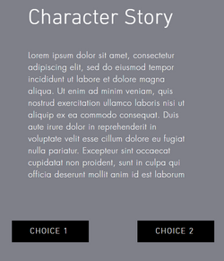
Here is where our project came to life. These pages were still very basic of course, simple text and a flat background colour. But it gave us the flow of the story. The text now appeared in smaller blocks, fading in one by one making them much easier to digest and more engaging. We also had the idea of choosing your character shown here, with very standard stock images! Including the homepage which we wanted simple, just to guide the user to start the story. Our idea was really taking shape here, feedback from our supervisor and user tests showed progress.


As creative lead my next step was to add more life and character to the story, I didn't want just text appearing. Here we tested different ideas such as gifs, images, videos and sounds which would become crucial to the final product.
Here you can view a walk-through of this prototype I recorded at the time.
Final Designs
From here my team mates worked on putting the actual content into the website. This was the story itself, the characters and the choices. They did fantastic work here and the project wouldn't have been the same without this work.
I then began designed the final product, turning the simple grey prototype into an immersive story with images, backgrounds, animations, sounds and more.
 |  |  |  |
|---|---|---|---|
 |  |  | 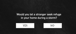 |
The backgrounds were very important, we wanted animated pages to produce an atmosphere but had to keep in mind accessbility to ensure text was still readable against such backgrounds. My favourite part about this is how you can really see how the final prototype, while very basic really brought the general idea to life before adding the designs.
You can view a short run through of the website here:
Final User Testing
As a team we went through a few final design tweaks such as different animations or images but ultimately we were extremely happy with how it turned out. We each conducted our own testing, to make sure pages loaded and everything was as expected. Then from here we sent to website to various friends and family and asked them for feedback. We choose different age ranges, such as friends in college or our parents. We wanted the product to be very simple and intuitive to use for everyone.
User Feedback Action
Some of the text on a specific page was hard to read against our animated background.
Change the font, it's colour and make it bold so it can easily be read.
An audio file was too loud causing a jump scare to users as they were not expecting it. This was not intentional.
Change the file to a quieter, less jarring
Some of the blocks of text faded in too slowly. As in, users were reading one paragraph and then had to wait for the next to fade in.
Adjust the speed of the animations and rigorously test.
Once we were satisfied with our own testing and external testing we submitted the project.
Overall we achieved a First Class Honours 1.1 in our final year project which was the highest grade we could get. This was really a mark of the hard work we put in, from initial ideation and research all the way to a finished product in 9 months.
You can view the website HERE